Introduction#
scicomap helps you build scientific visualizations with perceptually safer colormaps.
Many default colormaps can create false boundaries and hide important structure. The problem gets worse for readers with color-vision deficiency. scicomap gives you tools to inspect these issues and correct them.
Choose by data semantics#
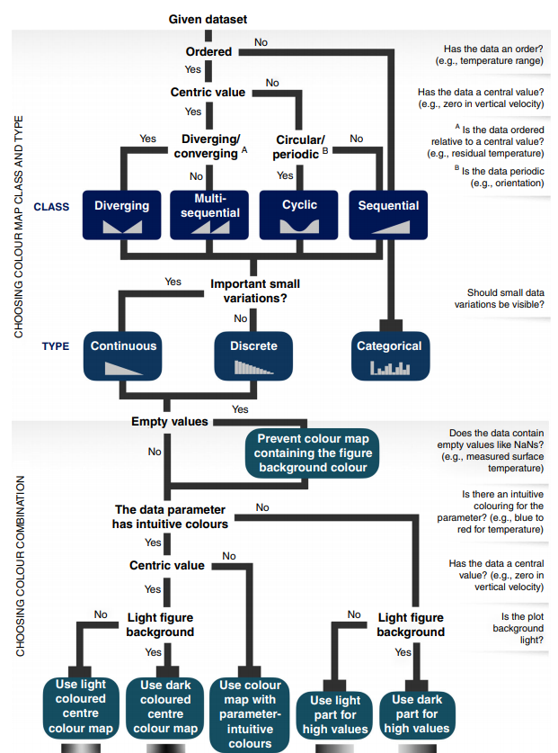
Choosing the right colormap family is the first high-impact decision.#
Why jet/rainbow is problematic#
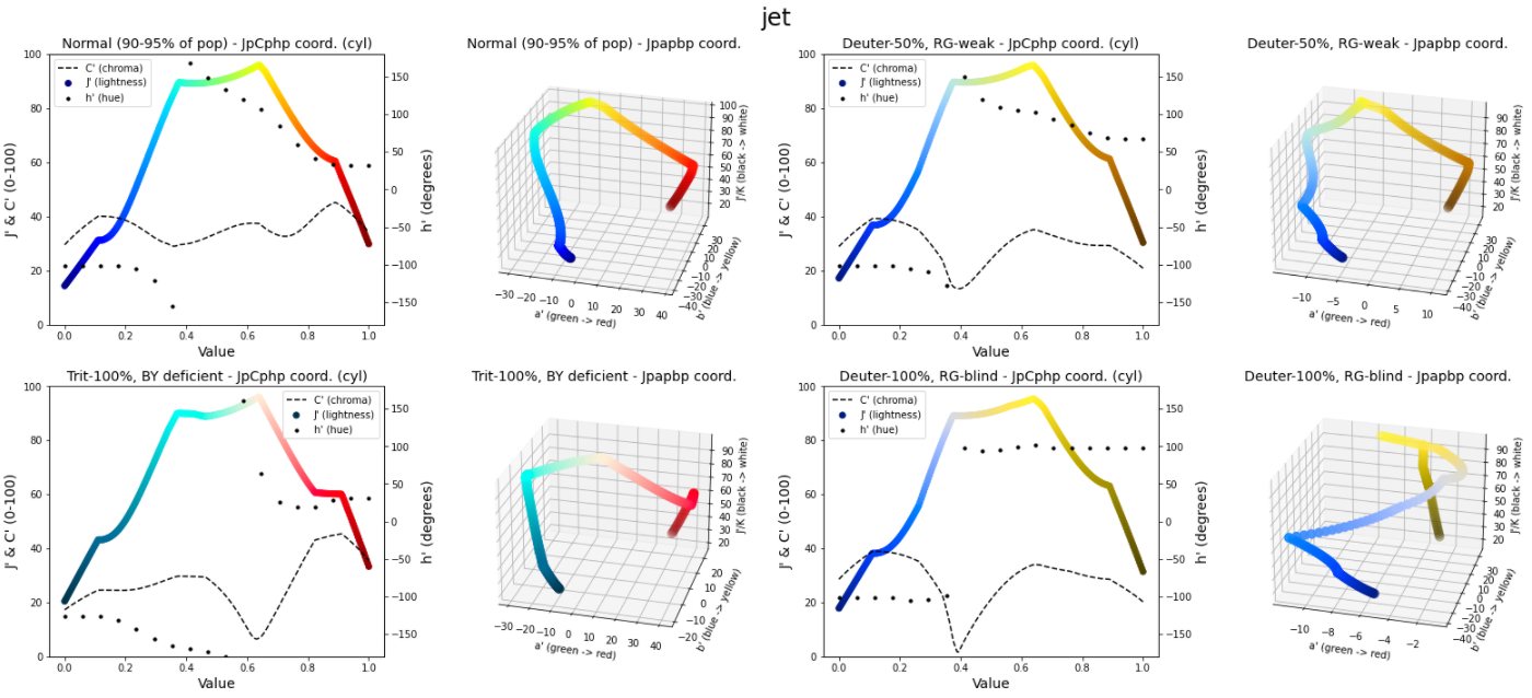
Jet is not perceptually uniform and tends to amplify false visual structure.#
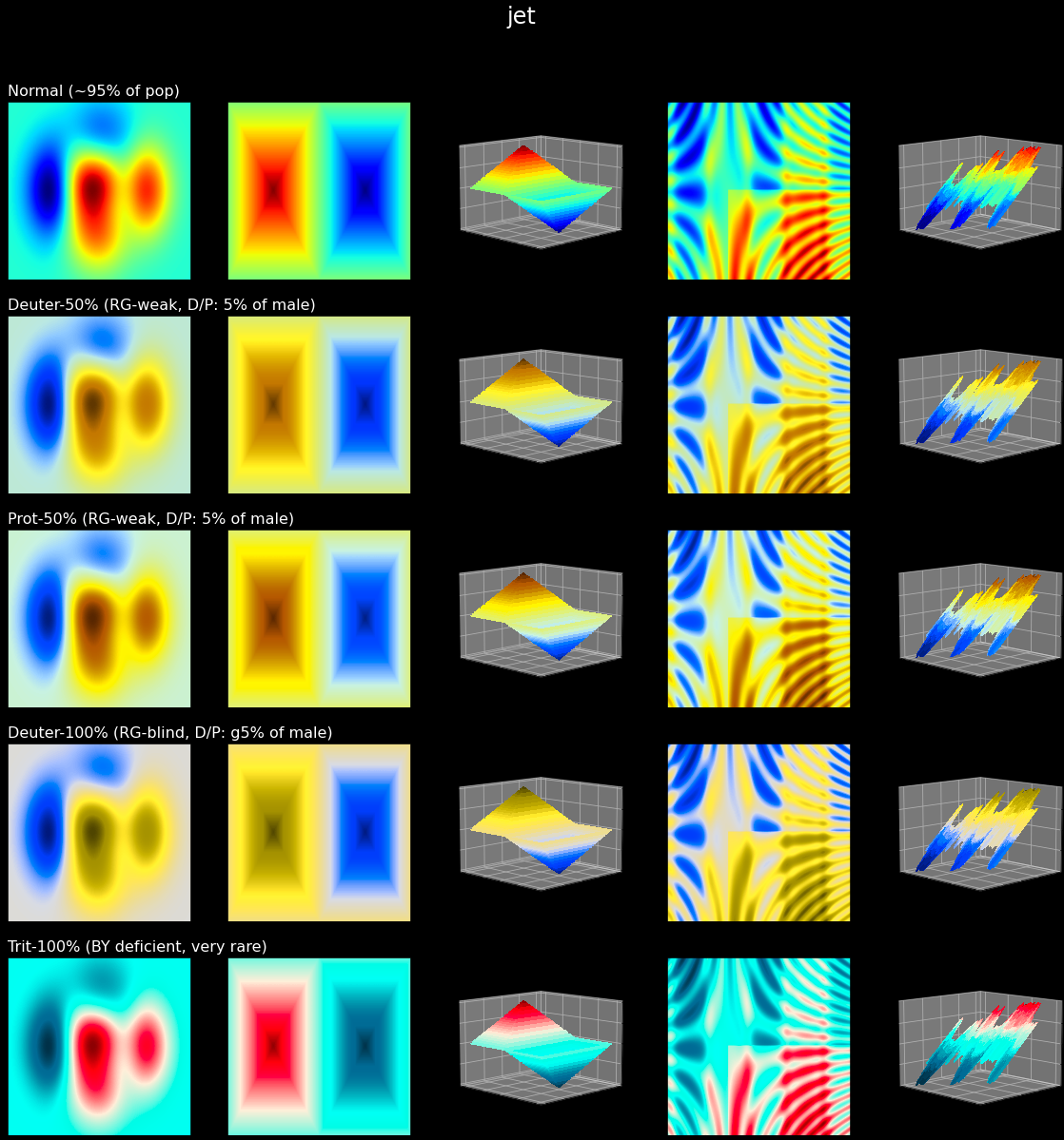
Artifact-heavy rendering can add boundaries that are not present in data.#
Color-vision accessibility#
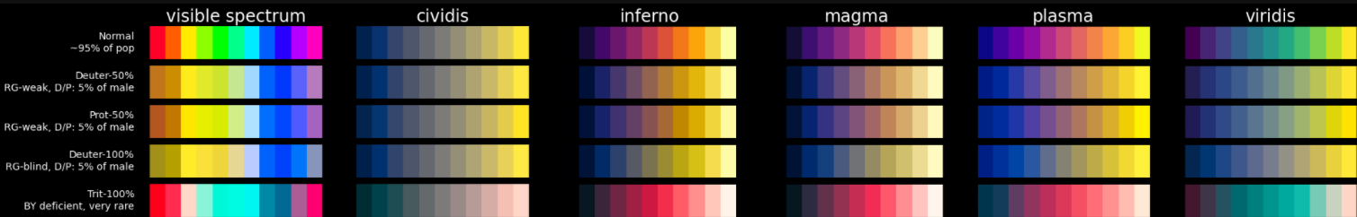
Around 8% of Caucasian male readers are affected by color-vision deficiencies, so accessibility checks are essential for trustworthy figures.#
Perceptual uniformity in practice#
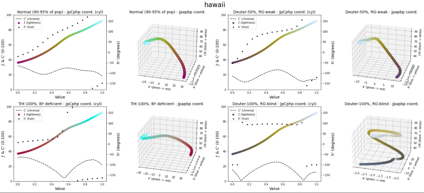
Baseline colormap assessment before correction.#
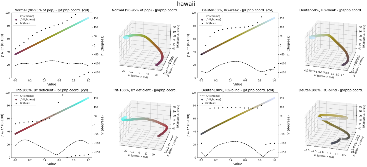
After uniformization, lightness and chroma behavior are typically smoother and less artifact-prone.#
What you can do with scicomap#
Browse colormaps by purpose (sequential, diverging, circular, qualitative).
Assess lightness, chroma symmetry, and colorblind accessibility.
Uniformize and symmetrize existing colormaps.
Generate examples that make artifacts easy to spot.
Who this project is for#
Researchers and engineers preparing figures for publications.
Data scientists building dashboards where color meaning must stay clear.
Anyone who needs better colormap defaults in Matplotlib workflows.
Next step#
Go to Getting Started for a copy-paste quickstart.
For guided examples#
Narrative walkthrough: Scicomap Tutorial
Interactive playground: Interactive Marimo Tutorial