The reported Gini is a concentration Gini for ranking only, not a normalized Gini. Equal prediction scores are aggregated into tied blocks, so row order inside a tie cannot change the result. It does not establish calibration. O/P ratio, exposure-weighted calibration deciles, and exposure-weighted mean Tweedie deviance with fixed power 1.5 assess different aspects of fit and must be reviewed alongside ranking.
Charts reuse the stored test positions. We calculate a training-only level adjustment for every candidate before reviewing raw and adjusted holdout metrics. The fitted estimators and their Run metrics remain raw.
On a first reading, follow training adjustment, held-out metrics, lift and calibration, and age one-ways, then use the review questions to move to scoring. Derivations and secondary diagnostics are optional sections below. holdout_diagnostics is a tutorial helper in _shared.qmd; it combines existing Azoic metrics on these same held-out rows.
The factor uses the stored training positions only and is frozen before we inspect holdout outcomes or metrics. It balances training totals; it need not improve test deviance, test O/P, or segment calibration. A positive factor preserves ranking while changing level diagnostics. The table shows training O/P for both main candidates and checks their adjusted training totals.
Re-predict both models on the stored holdout using rating features and exposure only, as in outcome-free scoring. The check reconciles raw metrics with each run; the tables show both scales on those same rows.
Reconcile run metrics and compare prediction scales
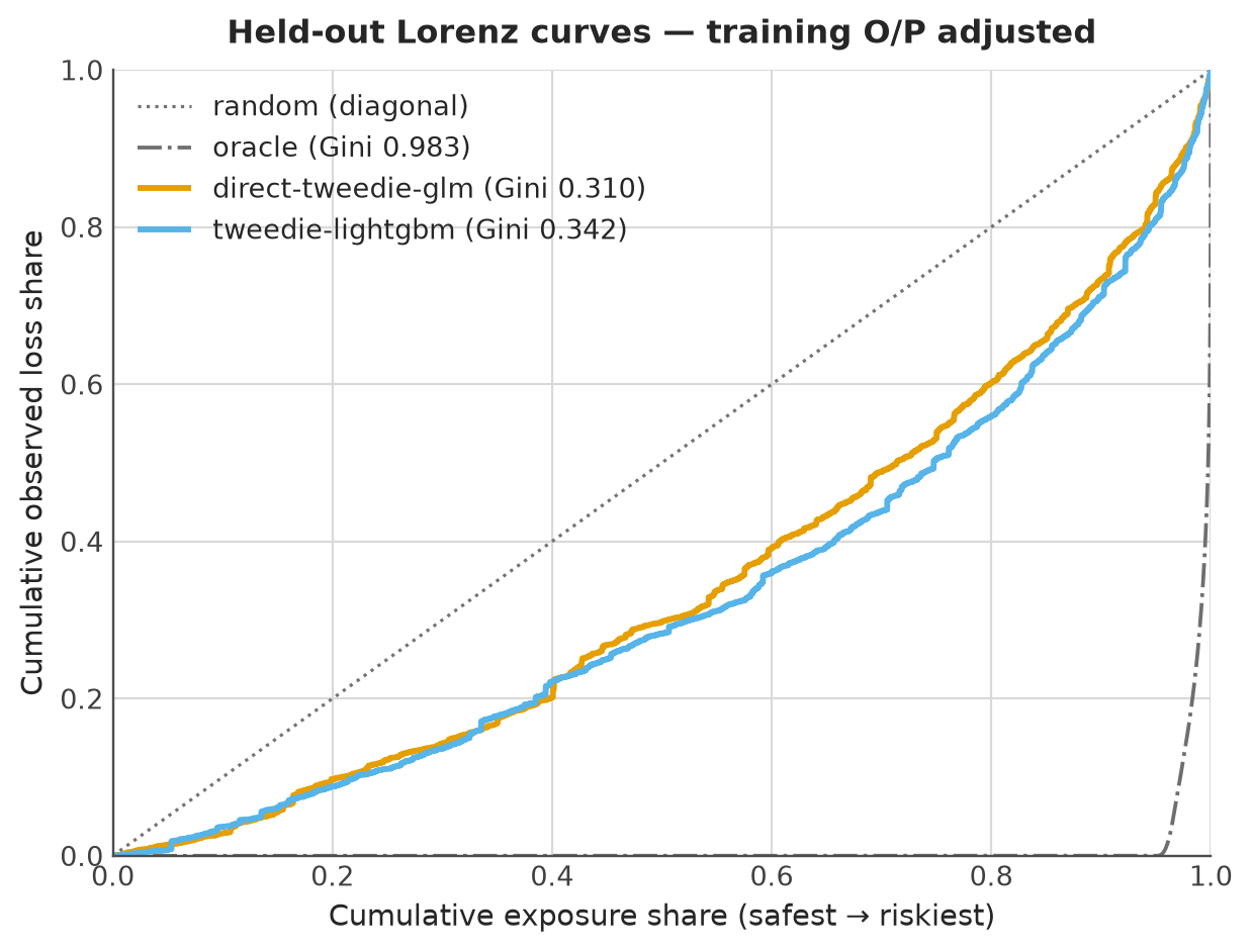
Lorenz curves for both main models on one axes — the dotted diagonal (random ranking) and the grey dash-dot oracle (hindsight ranking by observed rate) are drawn once, one color per model, Gini in the legend. The oracle is unavailable at prediction time and need not have Gini one. Gini is twice the signed area from the concentration curve to the diagonal. A lower curve dominates another only if it is nowhere above it; crossing curves do not establish dominance.
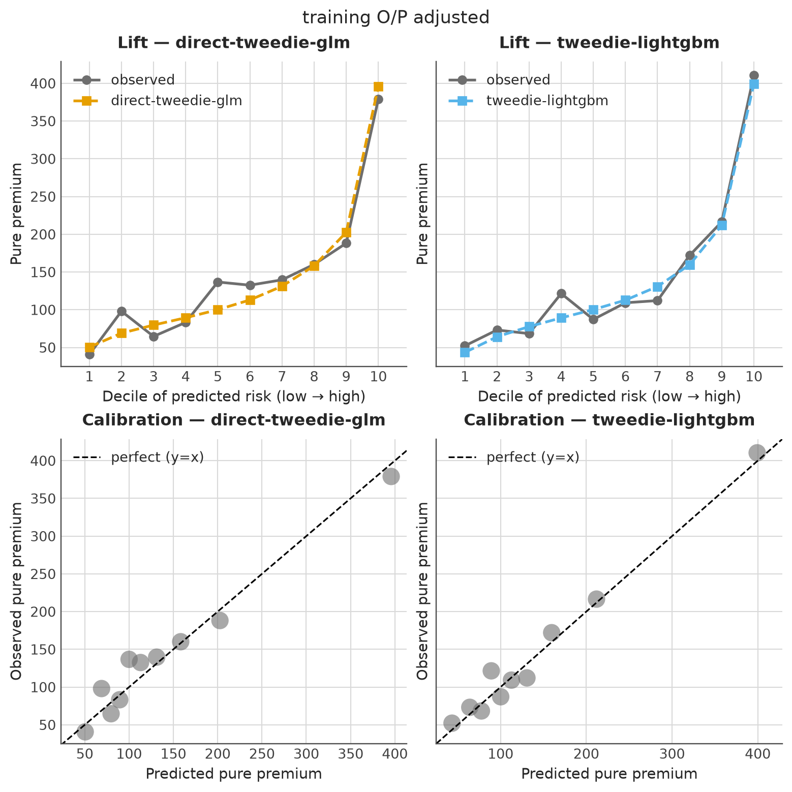
Lift and calibration grids, one panel per model, computed from the recalibrated test predictions. The lift chart shows the observed (grey) and predicted (model color) pure premium per exposure-balanced decile of predicted risk: the two lines should track in level (calibration) while observed rises with the decile (ranking), and crossings expose deciles where the model over- or under-prices. The calibration scatter shows level adequacy on the same rows.
Code
model_names =list(estimators)mosaic = [ [f"lift:{name}"for name in model_names], [f"cal:{name}"for name in model_names],]with azoic_style(): fig, axd = plt.subplot_mosaic( mosaic, figsize=(4*len(model_names), 8), sharey=True, layout="constrained" )for name in model_names: table = calibration_table(y_test, test_predictions[name], w_test, n_bins=10) plot_lift( table, color=colors[name], label=name, ax=axd[f"lift:{name}"], title=f"Lift — {name}", ) plot_calibration( table, ax=axd[f"cal:{name}"], title=f"Calibration — {name}", ) fig.suptitle(CHART_SCALE) fig.savefig(ARTIFACT_DIR /"lift_calibration.png", bbox_inches="tight") plt.show()
4.4 Age one-ways: held-out calibration at each raw age
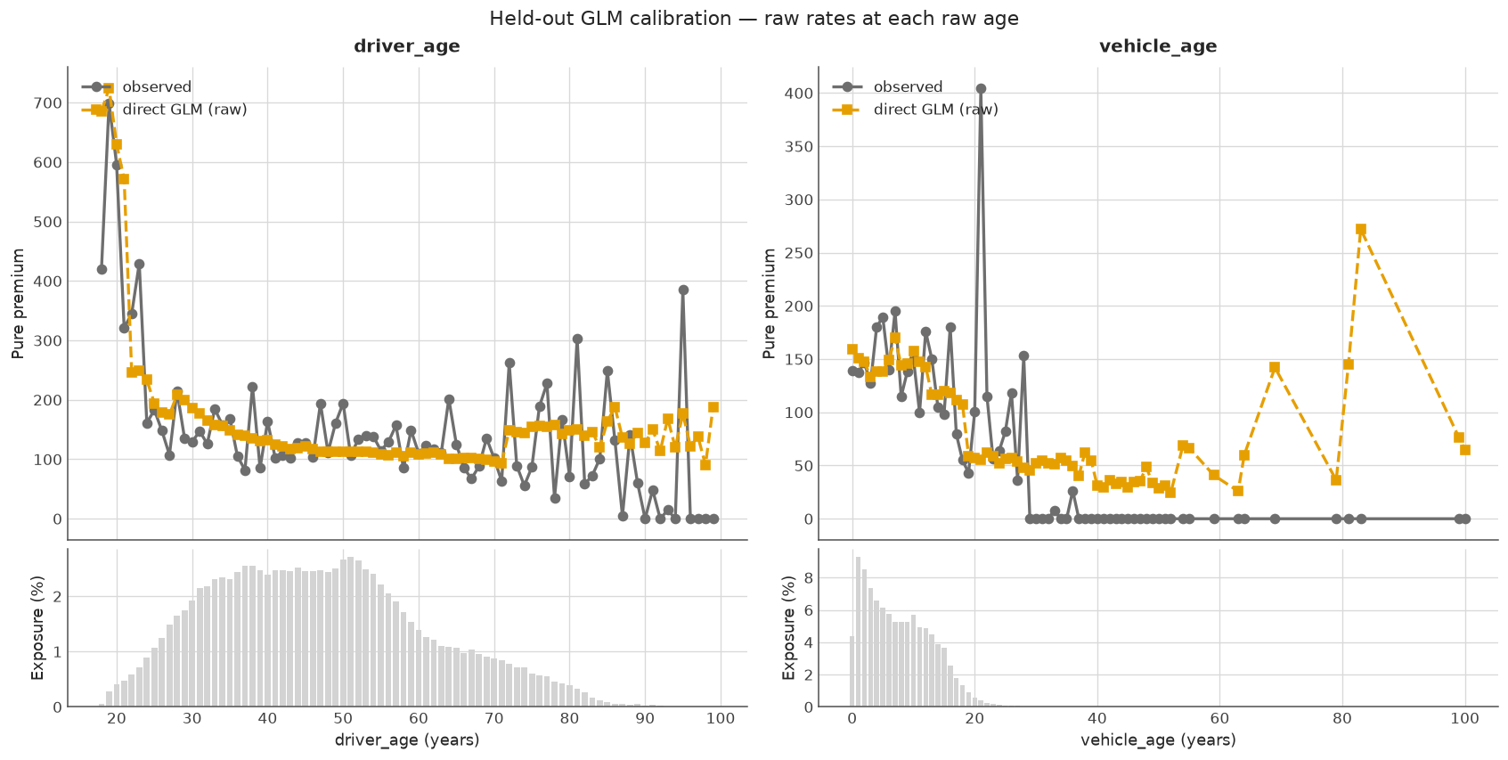
Start with driver and vehicle age on their original scales. Each point compares observed claims per exposure unit with the exposure-weighted mean prediction for held-out policies at that age. Exposure bars show the business supporting each comparison; sparse ages can have noisy observed rates. These views can reveal within-bin discrepancies that the grouped overview below averages away.
The predictions are the raw direct GLM baseline, without the training O/P multiplier. The x-axis uses raw ages; the fitted model still uses its original training bins. Other rating features and exposure composition change with age, so average GLM predictions can vary even inside one fitted age bin. These are portfolio comparisons, not isolated age effects or evidence of causality.
For individual conditional expectation (ICE) or partial dependence (PDP), use scikit-learn’s built-in PartialDependenceDisplay through the existing PDP/ICE recipe. ICE varies one feature while keeping each row’s other inputs fixed; PDP averages those predictions. Neither curve measures observed segment calibration.
4.5 What the results show, and what remains to review
With the default full portfolio, the raw GBM has lower deviance than the raw direct GLM (about 74.72 versus 75.34) and higher Gini (0.342 versus 0.310). After the training adjustments, both O/P ratios are close to 1.024: held-out claims still exceed predicted totals by about 2.4%. These figures change with the sample; they describe one split, not a final model choice.
The default lift curves cross: some deciles are overpredicted and others underpredicted. A training level adjustment therefore does not solve segment calibration. O/P below one means predicted claims exceed observed claims; O/P above one means the reverse. Read the actual O/P and deviance values for both scales in the holdout table before deciding whether the adjustment helps. The code verifies that this common multiplier leaves each candidate’s Gini unchanged; it does not verify that one model dominates another everywhere.
Use these questions to record a decision, not as a list of passed checks:
Question
Evidence here and remaining work
Does a candidate predict claims better on this split?
Compare Tweedie deviance (lower) and \(D^2\) (higher) on the same rows and prediction scale. One split does not establish superiority.
Is its level adequate?
Compare O/P with one, then inspect lift and age gaps. Aggregate balance can conceal subgroup errors.
Does it rank usefully?
Compare Gini and concentration curves; crossings do not establish dominance.
Which segments need review?
Locate observed/predicted gaps and check their exposure and claims support, especially sparse ages.
Is it suitable for use?
Fairness, business acceptability, and stability under refitting have not been established. These need separate review and evidence.
Continue to outcome-free scoring and tariff review. If these results prompt a model or factor change, use fresh evaluation data for that decision; repeated inspection makes this holdout development evidence.
4.6 Optional: Supporting overview: calibration inside fitted groups
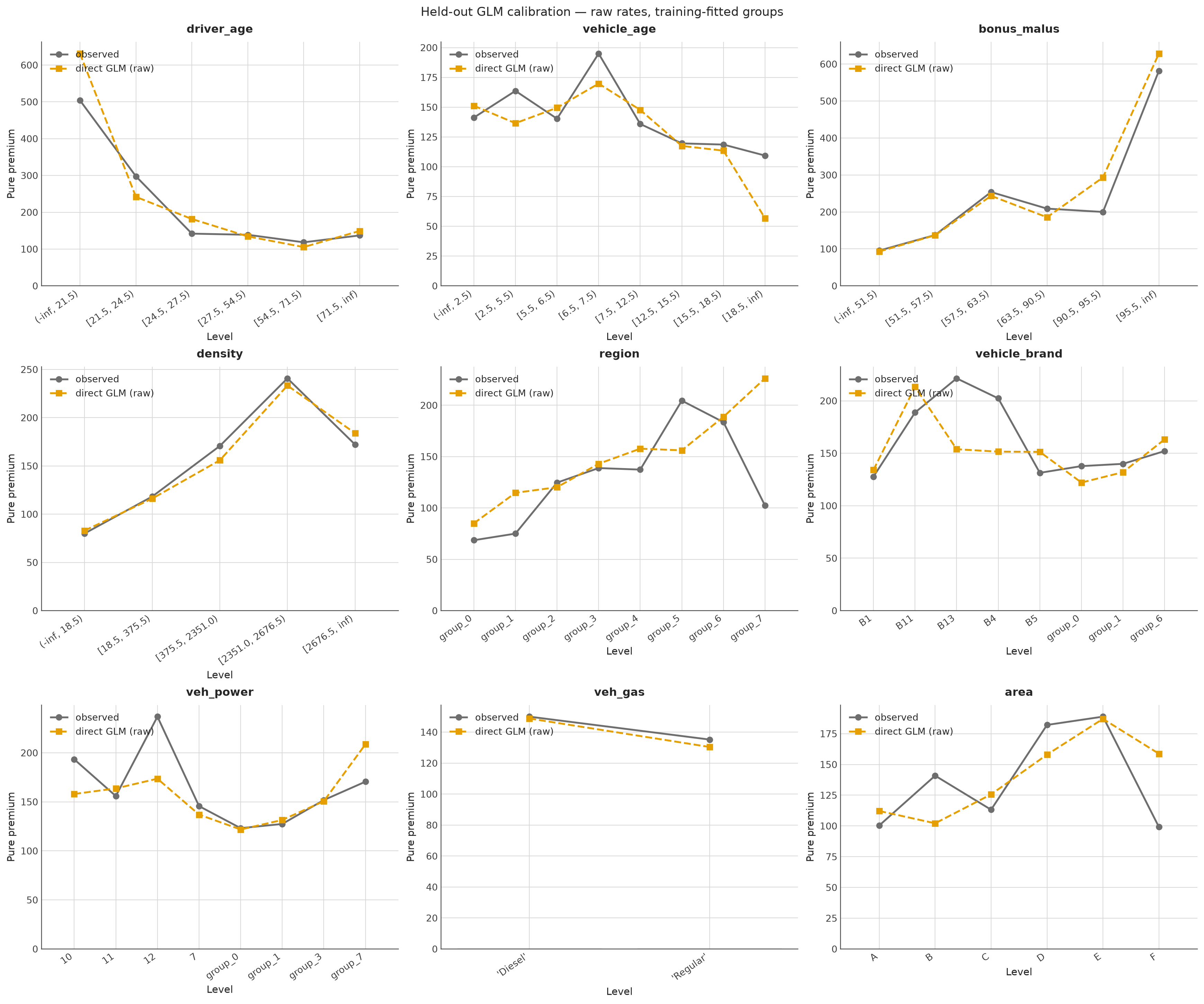
Across all rating factors, compare the same predictions and observations inside training-fitted bins and groups. This checks calibration across the implemented tariff segments. It also keeps continuous factors such as density readable, where a point for every distinct raw value would have little claims support. Every feature passes through the complete fitted preprocessing pipeline. Changing the reporting groups does not change any policy’s prediction.
4.7 Optional: Double-lift: raw GBM benchmark vs direct GLM baseline
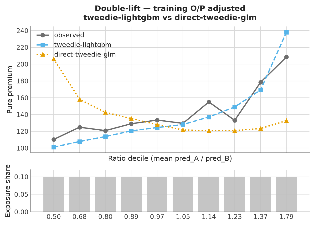
A double-lift chart groups policies by the ratio of the raw-feature GBM benchmark’s prediction (A) to the direct GLM baseline’s prediction (B). Both use their frozen training adjustments here. Compare the gap between observed pure premium and each model’s predicted pure premium within each ratio group. Rising observations alone cannot select a model. Extreme ratio groups contain the largest relative disagreements and can be particularly informative, provided their exposure and claims support credible comparisons; endpoints are not constrained to match observations. The table below the small example reports exposure and claim totals for the portfolio chart’s ratio groups.
The CAS GLM monograph, section 7.2.2, pp. 78–79 uses this within-group comparison with curves normalized by their respective portfolio averages. Azoic plots absolute rates, retaining level differences as well as relative disagreement; it does not normalize those curves.
For example, observed rates and B both equal \([10,20,30]\), while A predicts \([1,20,90]\). Observations rise with A/B, yet B matches every group and A has errors of \([9,0,-60]\). Four repetitions per ratio keep all three quantile groups in this small unit-exposure example.
4.8 Optional: Hexbin density: observed vs predicted rates, and rate residuals
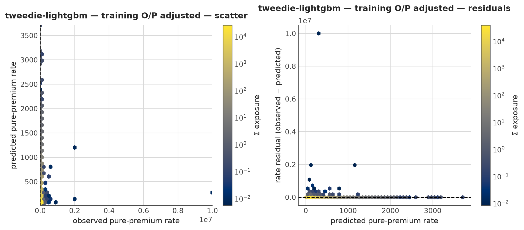
Per-policy densities for the training-adjusted working model: observed pure-premium rate versus predicted rate on the left (y=x dashed reference), and observed rate - predicted rate versus predicted rate on the right (zero reference). The plot converts aggregate y_test to rates with w_test before drawing either panel. Hex counts are exposure-weighted; the log colour scale concentrates on where the portfolio mass actually sits. Most policies have zero claims, so the scatter remains sparse at individual-policy level.
where \(u\) is cumulative exposure share and \(C(u)\) is cumulative claim share, ordered by increasing predicted rate. This is twice the signed area from the curve to the diagonal: it can be negative, and positive area in one part can offset negative area elsewhere. Zero Gini does not prove random ranking. Azoic integrates tied-score blocks; its result equals the midrank formula, but the implementation does not evaluate pairwise differences.
The pairwise absolute-difference inequality Gini instead measures dispersion of observed rates independently of model predictions. Its exposure-weighted form is
It equals the concentration Gini when the ordering score is the observed rate itself. Reversing model predictions flips concentration Gini’s sign and leaves inequality Gini unchanged. With rates \([1,3]\) and exposures \([1,2]\), claims are \([1,6]\) and the observed-rate curve passes through \((0,0)\), \((1/3,1/7)\), \((1,1)\). Its two trapezoids have areas \(1/42\) and \(8/21\): total \(17/42\). Thus \(G=2(1/2-17/42)=4/21\), not one even with perfect observed-rate ordering.
Any strictly increasing transformation that preserves the prediction ties preserves concentration Gini. In particular, the frozen positive training factors leave ranking unchanged; the holdout table verifies this for both main models while showing the change in level diagnostics.
4.10 Optional: Why model families do not guarantee balance
Write observed rate as \(r_i\), predicted rate as \(\mu_i\), and exposure as \(w_i\). Poisson, Gamma, and Tweedie deviances target conditional means; they do not inherently target a rate below the mean. Model restrictions, regularization, finite boosting iterations, and numerical convergence affect the achieved fit. Neither the GLM label nor a Poisson GBM objective guarantees portfolio balance.
From glum’s deviance derivative and log-link definitions, \(\partial d(r,\mu)/\partial\mu=2(\mu-r)/\mu^p\) and \(\partial\mu/\partial\beta_0=\mu\). Our derivation for a converged, unpenalized log-link GLM with an intercept therefore gives
For Poisson (\(p=1\)), this implies training total balance, \(\sum_i w_i\mu_i=\sum_i w_i r_i\). For Gamma (\(p=2\)) and Tweedie (\(1<p<2\)), the extra prediction-dependent factor prevents that conclusion in general. None of these training equations guarantees held-out balance, and balance of a frequency component does not establish balance of a frequency–severity product.
This small network-free example fits each family with just an intercept (the feature is zero), then with one varying feature. Every intercept-only fit recovers the exposure-weighted mean. The varying-feature Gamma and Tweedie fits satisfy their intercept equations while their O/P ratios differ from one; the Poisson fit is the control. The assertions allow solver error, rather than requiring particular fitted totals.
4.11 Optional: How to read these tables and charts
Four diagnostics answer four questions; a fifth (business sense) is checked by humans, not the model. The full guide lives in the docs site; the condensed version used here:
Concentration Gini measures prediction ordering, not premium level. A positive scalar leaves it unchanged. It is twice the signed area from the prediction-ordered curve to the diagonal and may be negative. Pairwise inequality Gini measures observed-rate dispersion; observed-rate ordering recovers that value. Azoic integrates tied-score blocks, equivalently the midrank formula, so row order within ties cannot affect the result.
Weighted deviance is the proper score matched to the response distribution (Poisson for frequency, Gamma for severity, Tweedie for pure premium). Smaller is better; one unit does not translate directly to euros. When the true distribution differs from the assumed, deviance is a proxy for accuracy, not a measurement of it.
\(D^2\) = \(1 - \text{deviance}/\text{null deviance}\), the explained-deviance share against the weighted-mean null. Higher is better. \(D^2\) is only comparable between models of the same response and same family; a frequency \(D^2\) cannot be ranked against a severity \(D^2\).
O/P (observed / predicted), also called A/E, is \(\sum_i w_i r_i / \sum_i w_i \mu_i\). A/E near 1 is necessary but not sufficient: a portfolio can hit 1.0 with offsetting biases that cancel across segments. Always segment-check (the one-way charts above are exactly that check).
Concentration curve — Gini is twice the signed area to the diagonal. A lower curve dominates another only if it is nowhere above it; crossing curves do not establish dominance. The diagonal is the random-ranking reference and also results from constant prediction scores.
Lift chart — observed and predicted per decile. The two should track on absolute level (calibration) and the observed should rise with the decile (ranking). Crossing signals that the model over-estimates in some deciles and under-estimates in others. The decile range is the rank-quality part; the gap between observed and predicted is the calibration part.
One-way chart — the predicted lines should sit close to the observed line per feature level. A bowed observed line without a matching predicted line is systematic miscalibration by segment, not bad ranking.
Double-lift chart — compare each predicted rate with observations within A/B ratio groups. Observed direction alone does not identify the better model. Extreme groups capture the largest relative disagreements; inspect their exposure and claims credibility. These are absolute-rate curves.
Hexbin (actual vs predicted) — exposure density locates common outcomes, including the claim-free band at observed rate zero. The default scatter axes span their respective observed and predicted ranges, which can differ greatly when a few losses dominate the observed rates. A dense residual band need not estimate the conditional mean: zero-heavy outcomes often produce a band near \(-\mu\) even for a well-calibrated model.
4.12 Optional: Additive and multiplicative residual patterns
Residuals are observed rate minus predicted rate: \(e_i=r_i-\mu_i\). Interpret credible, exposure-weighted grouped means before attributing a pattern to model structure. A constant non-zero conditional mean residual is an additive discrepancy. If instead \(r_i=c\mu_i\), then
\[
e_i=(c-1)\mu_i.
\]
That slope can be entirely multiplicative and removable by one factor. Remaining curvature after checking level can motivate reviewing features, the link, or interactions; density stripes alone do not diagnose their cause. Increasing spread is compatible with Poisson, Gamma, and Tweedie variance and is not by itself evidence of bias.
In the following deterministic grouped-mean examples, \(r=\mu+5\) leaves residuals \([5,5,5]\). Its portfolio O/P factor is 1.25, but applying it leaves \([2.5,0,-2.5]\): one multiplier cannot generally remove an additive error. For \(r=2\mu\), residuals initially equal \(\mu\) and multiplying predictions by two removes every error.
For the adjusted working model, the calibration bins already provide grouped mean residuals. Exposure and claim totals help assess how much evidence each bin contains; this table does not estimate uncertainty.